Free Candlestick Pattern Scanner
Stock Market Guides is not a financial advisor. Our content is strictly educational and should not be considered financial advice.
This is a free scanner that finds stocks exhibiting popular stock candlestick patterns.
| TICKER | YESTERDAY'S LAST PRICE | ENTER UP TO | CHART | TRADE STRATEGY | WINS* | LOSSES* | WIN %* | ANNUALIZED RETURN | TRADE DURATION | VOLUME | MARKET CAP | SECTOR | EARNINGS OVERLAP | DIVIDEND OVERLAP | TIME ADDED |
|---|---|---|---|---|---|---|---|---|---|---|---|---|---|---|---|
$326.57 | Pending* | Had a Heikin Ashi Breakout | IZOO IO ZO.OZ% I3OO.OI% | 1 week | 20,341,422 | $3,902,449.9M | Communication Services | No | No | Pending* | |||||
$497.18 | Pending* | Has a Small Doji Candle | IZOO IO ZO.OZ% I3OO.OI% | 1 week | 2,187,053 | $1,067,491.6M | Financial Services | No | No | Pending* | |||||
$119.90 | Pending* | Had a Heikin Ashi Breakout | IZOO IO ZO.OZ% I3OO.OI% | 1 week | 36,664,762 | $331,225.4M | Technology | No | No | Pending* | |||||
$115 | Pending* | Had a Heikin Ashi Breakout | IZOO IO ZO.OZ% I3OO.OI% | 1 week | 7,335,897 | $268,785.2M | Consumer Cyclical | No | No | Pending* | |||||
$87.27 | Pending* | Has a Small Doji Candle | IZOO IO ZO.OZ% I3OO.OI% | 1 week | 7,119,469 | $261,391.2M | Financial Services | No | No | Pending* | |||||
$335.39 | Pending* | Had a Heikin Ashi Breakout | IZOO IO ZO.OZ% I3OO.OI% | 1 week | 2,992,870 | $222,554.4M | Financial Services | No | No | Pending* | |||||
$83.93 | Pending* | Had a Heikin Ashi Breakout | IZOO IO ZO.OZ% I3OO.OI% | 1 week | 1,660,502 | $212,677.7M | Basic Materials | No | No | Pending* | |||||
$119.65 | Pending* | Had a Heikin Ashi Breakout | IZOO IO ZO.OZ% I3OO.OI% | 1 week | 1,350,879 | $197,882.7M | Financial Services | No | No | Pending* | |||||
$177.21 | Pending* | Had a Heikin Ashi Breakout | IZOO IO ZO.OZ% I3OO.OI% | 1 week | 5,482,890 | $193,177.4M | Communication Services | No | No | Pending* | |||||
$156.38 | Pending* | Had a Heikin Ashi Breakout | IZOO IO ZO.OZ% I3OO.OI% | 1 week | 3,515,706 | $170,367.5M | Consumer Cyclical | No | No | Pending* | |||||
*According to our backtests
*Pending until the market opens at 9:30am EST today
How to Use Our Free Candlestick Pattern Scanner
The above list represents stocks that have popular candlestick patterns today.
It's powered by our proprietary stock scanner, which searches once per day for stocks that have these patterns.
You can sort columns using the up and down arrows next to the column name. You can add filters for the column values by clicking the "Add Filter" button above the list of stocks. This scanner is designed for active stock traders.
This video shows how to use our scanner:
Scanner Features that Require a Subscription
Our free scanner offers you the ability to find stocks that have popular candlestick patterns, but you may need more than that to ensure you're making trades that have a true edge.
Our paid Swing Trading Service includes scanner features that are designed to offer you all the intelligence our research can offer. These are the scanner features you get if you pay for a subscription:
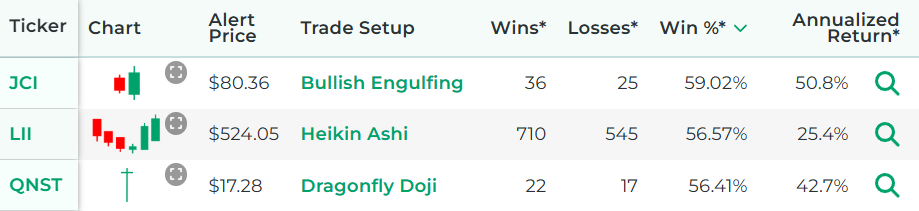
- See the historical backtested performance for each scan result. It looks like this:
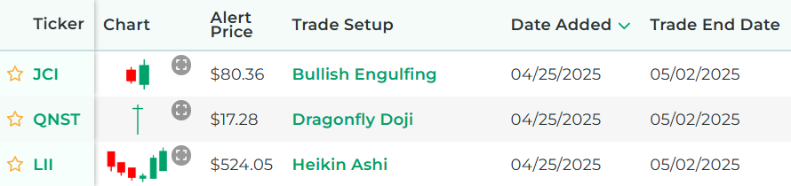
- See full trade setups for each scan result, including when to enter and exit. It looks like this:
- Get alerted when there are new scan results (by text or email).
- Get access to real-time scan updates throughout the trading day.
- Access scan results for all trading strategies in a single scan to easily see which trade setups have the best backtested performance across the entire market at any given time.
- Get access to scan results for our proprietary trading strategies, which required years of research to develop.
- Find Stock Trade Setups That Have a Backtested Edge
- Has DIY Swing Trading Scanner
- Get Swing Trade Picks from Our Scanner: 79.4% Average Annualized Return in Backtests
Here's a video that explains the difference between our free candlestick patterns scanner and the scanner from our paid service:
Stock Market Guides
Stock Market Guides identifies swing trading opportunities that have a historical track record of profitability in backtests.
Average Annualized Return?
79.4%
Which Candlestick Patterns Are Included In Our Scanner?
The follow popular candlestick patterns are ones that are included in the above scanner:
Bullish Engulfing Candlestick Pattern
A bullish engulfing pattern is a type of price candlestick pattern found on a stock chart.
Stock charts show how a stock's price has changed over time, and that price activity can be conveyed in different ways. One of those ways is with price candlesticks, or price candles, which are also sometimes referred to as price bars.
Each price candle represents a pre-specified period of time, such as one day or one hour. Candles give information that might be pertinent to an investor, including the open price, close price, high price, and low price of the period.
A bullish engulfing candlestick pattern consists of two candles:
- First candle - The first candle is a red candle, which indicates that the price declined during that period.
- Second candle - The second candle is a green candle, which indicates that the price went up during that period. The second candle opens below the low price of the first candle and closes above the high price of the first candle. In other words, the "body" of the second candle is taller than the entire height of the first candle.
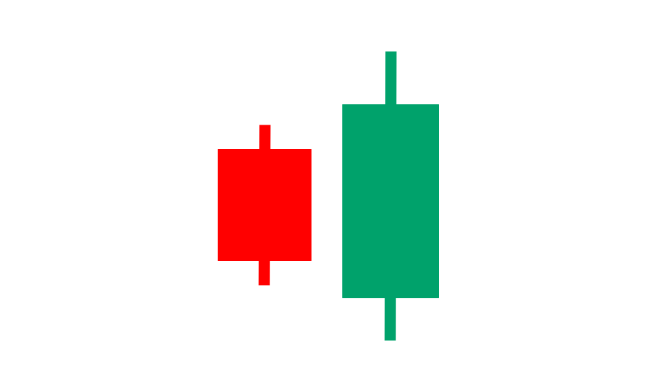
That image is a graphical icon that gives an idea visually of what a bullish engulfing pattern looks like.
You can see that the first candle is red and the second candle is green.
Also, the body of the second candle is tall enough to engulf the first candle altogether.
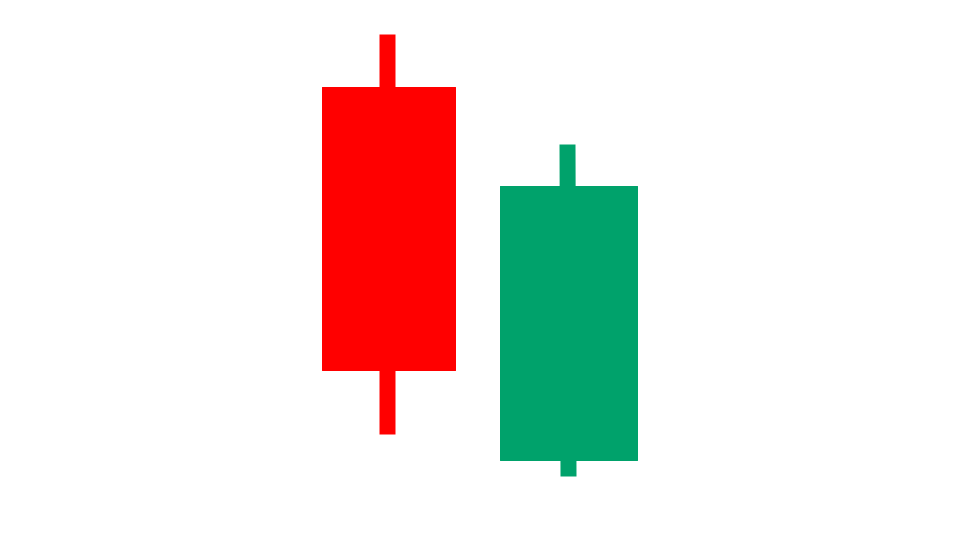
Bullish Harami Candlestick Pattern
A bullish harami pattern is a type of price candlestick pattern found on a stock chart.
Stock charts show how a stock's price has changed over time, and that price activity can be conveyed in different ways. One of those ways is with price candlesticks, or price candles, which are also sometimes referred to as price bars.
Each price candle represents a pre-specified period of time, such as one day or one hour. Candles give information that might be pertinent to an investor, including the open price, close price, high price, and low price of the period.
A bullish harami candlestick pattern consists of two candles:
- First candle - The first candle is a red candle, which indicates that the price declined during that period.
- Second candle - The second candle is a green candle, which indicates that the price went up during that period. The first candle opens above the high price of the second candle and closes below the low price of the second candle. In other words, the "body" of the first candle is taller than the entire height of the second candle.

That image is a graphical icon that gives an idea visually of what a bullish harami pattern looks like.
You can see that the first candle is red and the second candle is green.
Also, the body of the first candle is tall enough to engulf the second candle altogether.
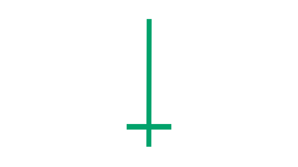
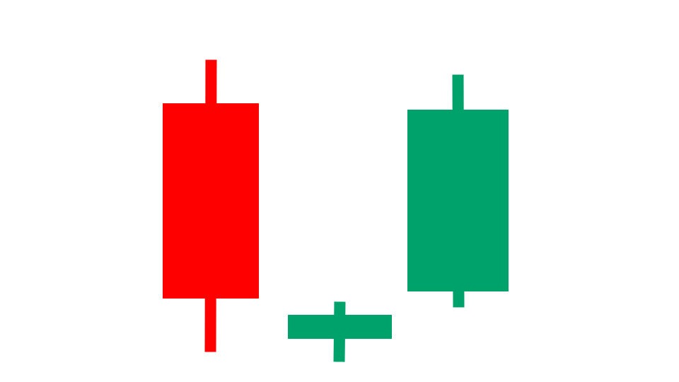
Dragonfly Doji Candle
A dragonfly doji candle is a type of price candlestick found on a stock chart.
Stock charts show how a stock's price has changed over time, and that price activity can be conveyed in different ways. One of those ways is with price candlesticks, or price candles, which are also sometimes referred to as price bars.
Each price candle represents a pre-specified period of time, such as one day or one hour. Candles give information that might be pertinent to an investor, including the open price, close price, high price, and low price of the period.
A doji candle is a special type of price candle where the open price and close price are the same (or very close to it).
A dragonfly doji candle is a type of doji candle where the open and close prices are relatively high on the candle and close to the high price.
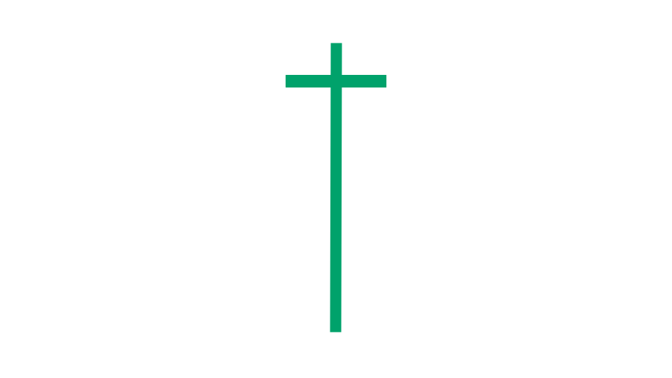
That image is a graphical icon that gives an idea visually of what a dragonfly doji candle looks like.
You can see that the body of the candle, whose height represents the difference between the open price and close price, is almost nonexistent. That means the open price is roughly equal to the close price of that candle. That's what makes it a doji candle.
Also, this candle looks like a cross where the horizontal line is near the high price. That's what makes it specifically a dragonfly type of doji candle.
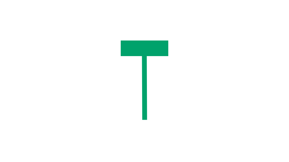
Gravestone Doji
A gravestone doji candle is a type of price candlestick found on a stock chart.
Stock charts show how a stock's price has changed over time, and that price activity can be conveyed in different ways. One of those ways is with price candlesticks, or price candles, which are also sometimes referred to as price bars.
Each price candle represents a pre-specified period of time, such as one day or one hour. Candles give information that might be pertinent to an investor, including the open price, close price, high price, and low price of the period.
A doji candle is a special type of price candle where the open price and close price are the same (or very close to it).
A gravestone doji candle is a type of doji candle where the open and close prices are relatively low on the candle and close to the low price.
That image is a graphical icon that gives an idea visually of what a gravestone doji candle looks like.
You can see that the body of the candle, whose height represents the difference between the open price and close price, is almost nonexistent. That means the open price is roughly equal to the close price of that candle. That's what makes it a doji candle.
Also, this candle looks like a cross where the horizontal line is near the low price. That's what makes it specifically a gravestone type of doji candle.
Hammer Candle
A hammer candle is a type of price candlestick found on a stock chart.
Stock charts show how a stock's price has changed over time, and that price activity can be conveyed in different ways. One of those ways is with price candlesticks, or price candles, which are also sometimes referred to as price bars.
Each price candle represents a pre-specified period of time, such as one day or one hour. Candles give information that might be pertinent to an investor, including the open price, close price, high price, and low price of the period.
A hammer candle is a special type of price candle that has the following characteristics:
- No upper wick - The body of a hammer candle is at the very top of the candlestick. This means that the high of the period is equal to either the open or closing price.
- Short candle body - Typically, hammer candles have short bodies that take up less than a quarter of the entire price candle's height.
- Long lower wick - The lower wick of the price candle, which extends downward from the short body, is relatively long.
These characteristics give the candlestick the appearance of a hammer.
That image is a graphical icon that gives an idea visually of what a hammer candle looks like.
You can see that the body of the candle, whose height represents the difference between the open price and close price, is at the very top of the candle.
It has a short body and long lower wick. It looks very roughly like a hammer or a mallet.
Heikin Ashi Breakout
Heikin ashi candles are a type of price candlestick found on a stock chart.
Stock charts show how a stock's price has changed over time, and that price activity can be conveyed in different ways. One of those ways is with price candlesticks, or price candles, which are also sometimes referred to as price bars.
Each price candle represents a pre-specified period of time, such as one day or one hour. Candles give information that might be pertinent to an investor, including the open price, close price, high price, and low price of the period.
Heikin Ashi price candles are different from the typical ones seen on most stock charts. They have the same shape and type of appearance, but they are calculated differently.
The term "Heikin Ashi" comes from the Japanese language, and it translates to "average bars." This is because each Heikin Ashi candle is calculated based on the average of prices during a given period.
They are similar to traditional candlestick charts, but they show price movement in a way that many traders find makes trends more apparent.
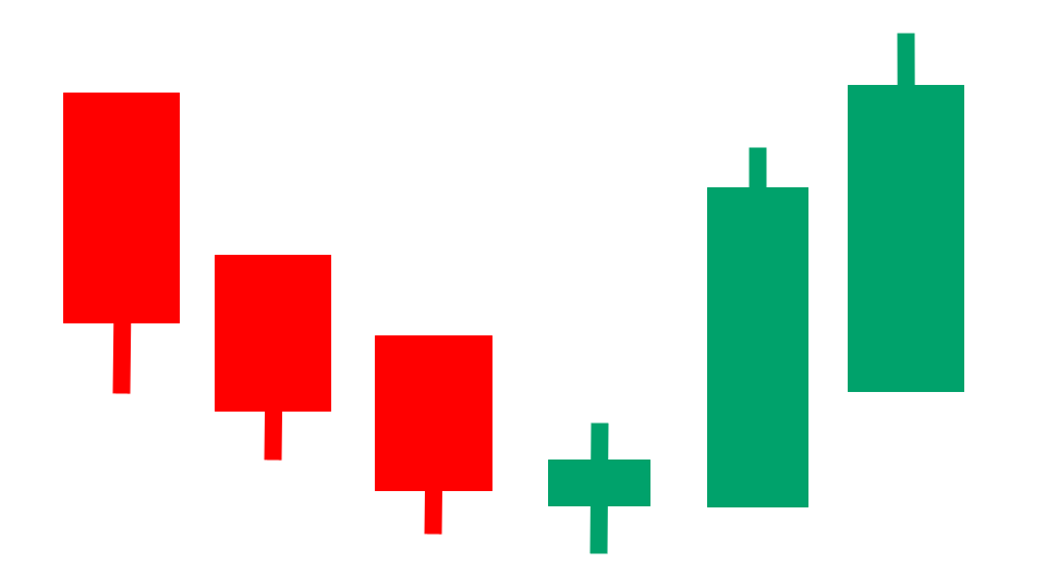
That image is a graphical icon that gives an idea visually of what a chart with heikin ashi candles might look like. The red and green bars have a tendency to cluster together, which makes it easier to spot trends.
A heikin ashi breakout occurs when the heikin ashi candles turn from red to green.
Inverted Hammer Candle
An inverted hammer candle is a type of price candlestick found on a stock chart.
Stock charts show how a stock's price has changed over time, and that price activity can be conveyed in different ways. One of those ways is with price candlesticks, or price candles, which are also sometimes referred to as price bars.
Each price candle represents a pre-specified period of time, such as one day or one hour. Candles give information that might be pertinent to an investor, including the open price, close price, high price, and low price of the period.
An inverted hammer candle is a special type of price candle that has the following characteristics:
- No lower wick - The body of an inverted hammer candle is at the very bottom of the candlestick. This means that the low of the period is equal to either the open or closing price.
- Short candle body - Typically, inverted hammer candles have short bodies that take up less than a quarter of the entire price candle's height.
- Long upper wick - The upper wick of the price candle, which extends upward from the short body, is relatively long.
These characteristics give the candlestick the appearance of a hammer that's upside down, or an inverted hammer.
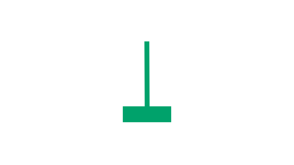
That image is a graphical icon that gives an idea visually of what an inverted hammer candle looks like.
You can see that the body of the candle, whose height represents the difference between the open price and close price, is at the very bottom of the candle.
It has a short body and long upper wick. It looks very roughly like a hammer or mallet that's upside down.
Long-Legged Doji
A long-legged doji candle is a type of price candlestick found on a stock chart.
Stock charts show how a stock's price has changed over time, and that price activity can be conveyed in different ways. One of those ways is with price candlesticks, or price candles, which are also sometimes referred to as price bars.
Each price candle represents a pre-specified period of time, such as one day or one hour. Candles give information that might be pertinent to an investor, including the open price, close price, high price, and low price of the period.
A doji candle is a special type of price candle where the open price and close price are the same (or very close to it).
A long-legged doji candle is a type of doji candle where the open and close prices are roughly halfway between the high and low prices.
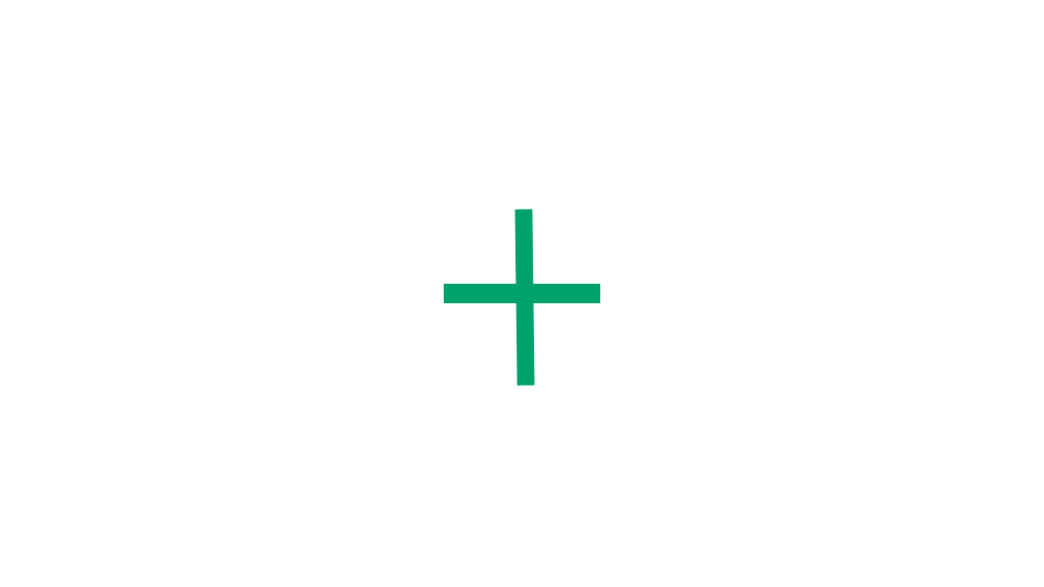
That image is a graphical icon that gives an idea visually of what a long-legged doji candle looks like.
You can see that the body of the candle, whose height represents the difference between the open price and close price, is almost nonexistent. That means the open price is roughly equal to the close price of that candle. That's what makes it a doji candle.
Also, this candle looks like a cross where the horizontal line is halfway between the high and low prices. That's what makes it specifically a long-legged type of doji candle.
Morning Star Candlestick Pattern
A morning star pattern is a type of price candlestick pattern found on a stock chart.
Stock charts show how a stock's price has changed over time, and that price activity can be conveyed in different ways. One of those ways is with price candlesticks, or price candles, which are also sometimes referred to as price bars.
Each price candle represents a pre-specified period of time, such as one day or one hour. Candles give information that might be pertinent to an investor, including the open price, close price, high price, and low price of the period.
A morning star candlestick pattern consists of three candles:
- First candle - The first candle is typically a long red candle, indicating selling pressure where the closing price is lower than the opening price.
- Second candle - This candle is typically relatively short and can be either red or green. Its body is small compared to the first candle, and it often gaps down from the close of the first candle. This candle reflects indecision in the market and sometimes takes the form of a doji candle.
- Third candle - The third candle typically has a long green body and opens at or below the midpoint of the second candle’s body.
That image is a graphical icon that gives an idea visually of what a morning star pattern looks like.
You can see that the first candle is red and tall. The third candle is green and tall.
The second candle is a small candle that is near or below the bottom of the first candle. It doesn't have a tall body, which reflects a lack of strong conviction from buyers or sellers.
Piercing Candlestick Pattern
A piercing pattern is a type of price candlestick pattern found on a stock chart.
Stock charts show how a stock's price has changed over time, and that price activity can be conveyed in different ways. One of those ways is with price candlesticks, or price candles, which are also sometimes referred to as price bars.
Each price candle represents a pre-specified period of time, such as one day or one hour. Candles give information that might be pertinent to an investor, including the open price, close price, high price, and low price of the period.
A piercing candlestick pattern consists of two candles:
- First candle - The first candle is a red candle, which indicates that the price declined during that period.
- Second candle - The second candle is a green candle, which indicates that the price went up during that period. The second candle opens below the low price of the first candle and closes at least halfway up the body of the first candle.
That image is a graphical icon that gives an idea visually of what a piercing pattern looks like.
You can see that the first candle is red and the second candle is green.
Also, the body of the second candle is tall enough to engulf the first candle altogether.
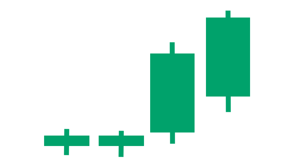
Three Inside Up Candlestick Pattern
A three inside up pattern is a type of price candlestick pattern found on a stock chart.
Stock charts show how a stock's price has changed over time, and that price activity can be conveyed in different ways. One of those ways is with price candlesticks, or price candles, which are also sometimes referred to as price bars.
Each price candle represents a pre-specified period of time, such as one day or one hour. Candles give information that might be pertinent to an investor, including the open price, close price, high price, and low price of the period.
A three inside up candlestick pattern consists of three candles:
- First candle - The first candle is a long red candle, indicating strong selling pressure where the closing price is noticeably lower than the opening price.
- Second candle - The second candle is a smaller green candle that is completely within the range of the first candle, meaning its high is lower than the high of the first candle and its low is higher than the low of the first candle.
- Third candle - The third candle is another green candle that breaks the high price of the second candle.
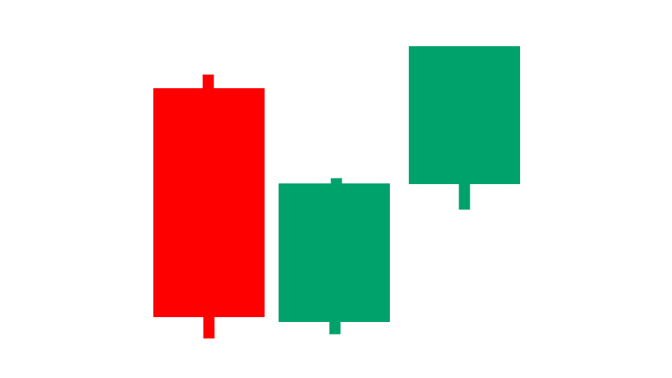
That image is a graphical icon that gives an idea visually of what a three inside up pattern looks like.
You can see that the first candle is red and the second and third candles are green.
Also, the first candle fully envelopes the second candle. And the high price of the third candle exceeds the high price of the second candle.
Three Outside Up Candlestick Pattern
A three outside up pattern is a type of price candlestick pattern found on a stock chart.
Stock charts show how a stock's price has changed over time, and that price activity can be conveyed in different ways. One of those ways is with price candlesticks, or price candles, which are also sometimes referred to as price bars.
Each price candle represents a pre-specified period of time, such as one day or one hour. Candles give information that might be pertinent to an investor, including the open price, close price, high price, and low price of the period.
A three outside up candlestick pattern consists of three candles:
- First candle - The first candle is a short red candle, indicating selling pressure where the closing price is lower than the opening price.
- Second candle - The second candle is a green candle that completely engulfs the first candle, meaning its opening price is below the first candle's low price, and its closing price is above the first candle's high price.
- Third candle - The third candle is another green candle that breaks the high price of the second candle.
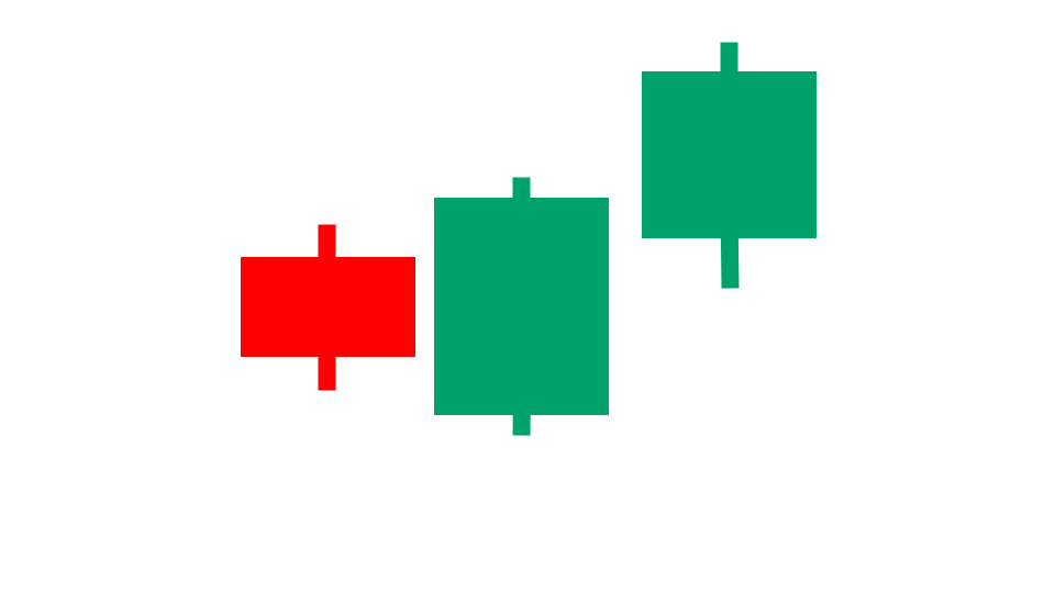
That image is a graphical icon that gives an idea visually of what a three outside up pattern looks like.
You can see that the first candle is red and the second and third candles are green.
Also, the second candle fully envelopes the first candle. And the high price of the third candle exceeds the high price of the second candle.
How We Find Stock Candlestick Patterns Each Day
Our one-of-a-kind scanning technology is at the heart of everything we do here. We have a way to define popular stock candlestick patterns in our scanner, and then it uses real-time data feeds to find any stocks that meet those criteria.
Learn More at Stock Market Guides
Want to learn other popular indicators, chart patterns, and candlestick patterns? Check them out here:
Have Questions About Candlestick Patterns or About Our Services?
If you have questions about stock candlestick patterns or questions about any services we offer, you can contact us any time and we'll be ready to help.
Join Our Free Email List
Get emails from us about ways to potentially make money in the stock market.
Stock Market Guides
You can trade without an edge, but why?
What We Offer
Stock Market Guides identifies swing trading opportunities that have a historical track record of profitability in backtests.
Average Annualized Return?
79.4%